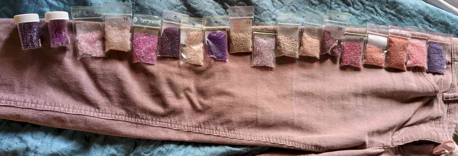
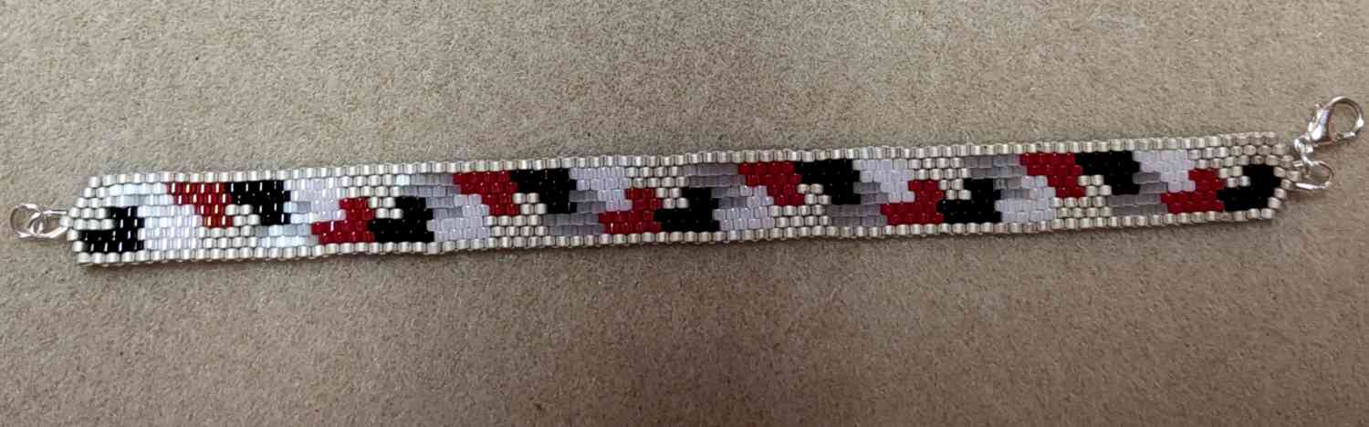
This is designing my way: match colors with the basics and go from there.
I usually use beaded samples, because some colours are slightly different when beaded, but I am not yet done with this colour group....
Fun part: I have a weird, not common type of colour blindness, close colours (like dark brown/green/blue/.. ) I see as the same color. Like for those mentioned, to me the are black. Same with other colours. White is a huge problem, so I have 3 'safe' numbers to use when I feel I am in colour trouble.
Thank goodness my dear husband sees it all clear and doesn't mind me asking for a final color check in case I doubt too much. 😂